Format text with pixels

in Vexy Lines
Vexy Lines
Truly use your variable fonts
One variable font is worth a thousand font styles.
You change the instance value of a variation axis, and the weight, width, slant or contrast of the text adjusts slightly and smoothly.
Most apps let you choose the font instance per paragraph or per word. Making finer adjustments is tedious.
With the Vexy Lines app for Mac and Windows you can use an image to drive the instance selection and to create variable typography.
Vexy Lines: Text fill
Format every glyph using pixels
With the Text fill in Vexy Lines, you can typeset text in a unique creative way.
Your text runs along the pattern of strokes defined by the base fill. It can dynamically change size & variable instance depending on the pixel brightness of the underlying source image.

1
A simple linear gradient from white to black plus a variable Futura.
Drop the Source image to guide instance selection.

3
Add Text fill based on the base fill. Edit your text. Pick a variable font.
Choose Weight as the active variable font axis: lighter pixels make text lighter, darker pixels darken the text.
4
Hide the base fill or make it transparent to only see the Text fill.
Export to a PDF file or to clipboard — voilà! A typographic gradient of weight progression.
Text fill & variable font
Variable fonts for expressive typography
Take a look at a more sophisticated example that shows how we use the text fill with a variable font. Our task is to wrap an expressive poem into a matching typographic form.

Analysis
Expression explained
We use the Playfair variable font by Claus Eggers Sørensen. This follow-up to the earlier Playfair Display is an impressive typographic machine.
It’s variable across four variation axes: Weight, Width, Italic and Optical Size. Here we vary the font size and the optical size.

The shape of a flame
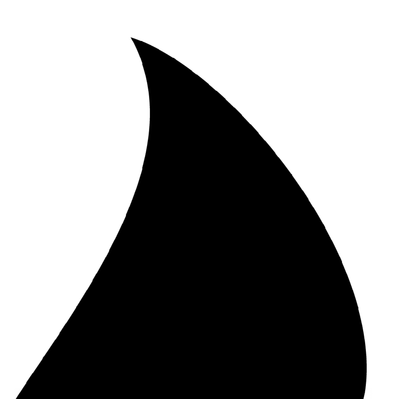
In Illustrator, we draw a schematic tongue of fire, with its tip already leaning as if something just breathed on it. We export it as a PNG.
We drop the image into a new Vexy Lines document, so it becomes the Source image.
Horizontal heat
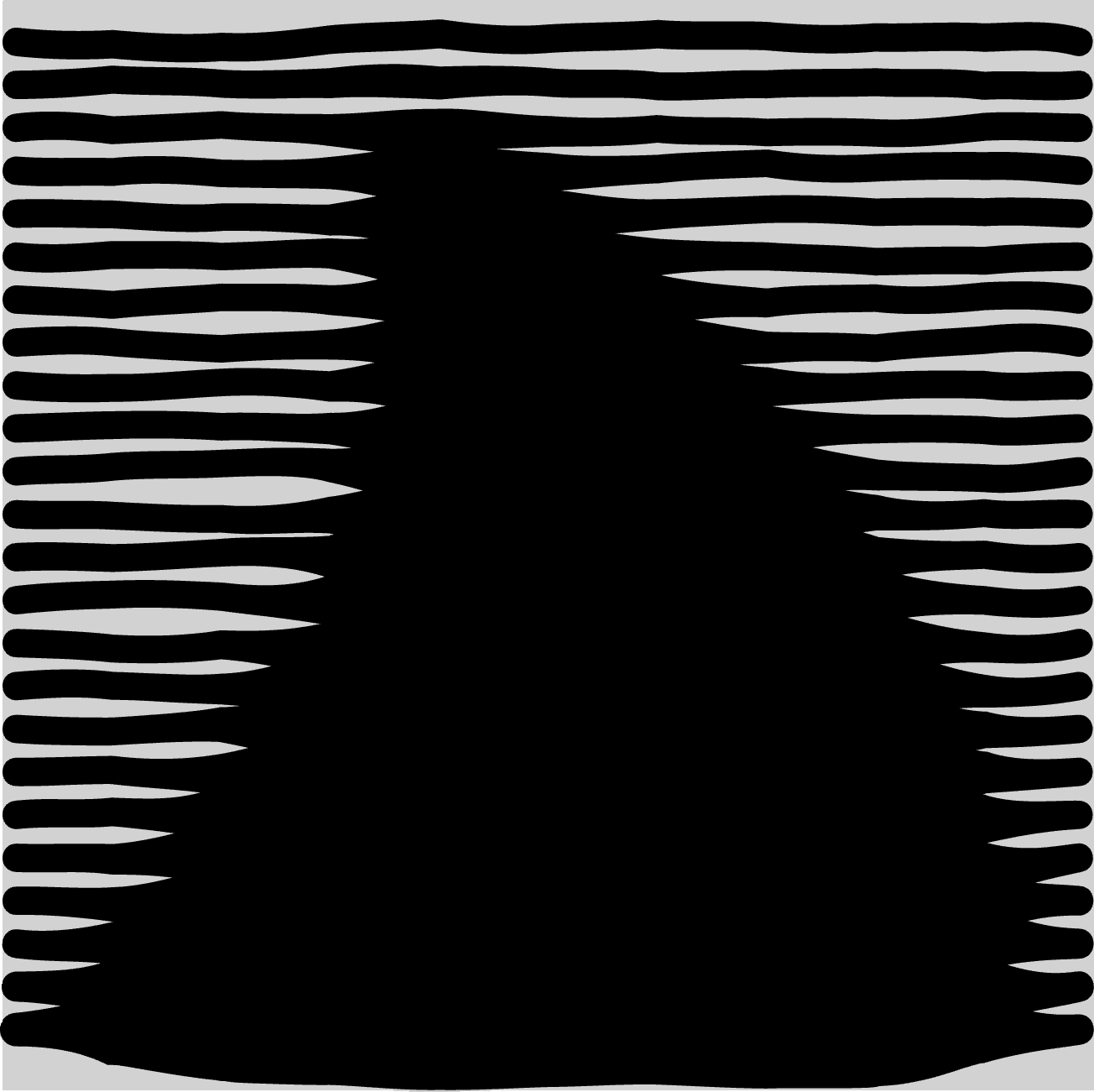
We add a single Linear fill that rakes the flame into level bands — slow and calm across the crest, packed tight and restless toward the base.
In Filters, we apply the Blur to the signal (the way the fill interprets the source). This allows for a gradual grow of the Stroke thickness, which modulates the font size within the thickness range (make the same min and max thickness to keep the font size constant).

We add Wobble to the fill to add some organic movement of the baselines. The Stroke interval will set the line spacing.
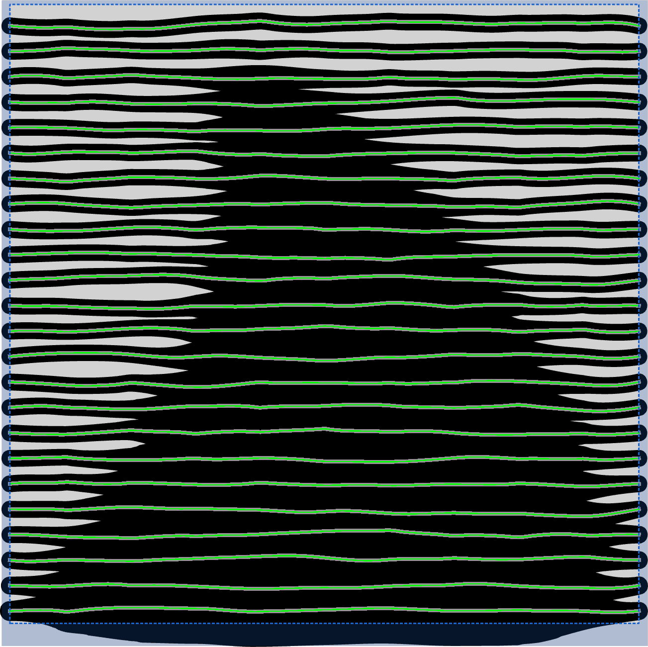
We draw a rectangular Mask. We leave a small opaque distance on top, left and right, and a bit more opaque distance at the bottom (where the final line of the poem will be typeset.). The mask ensures that the strokes, and therefore the text, will not touch the document edges.
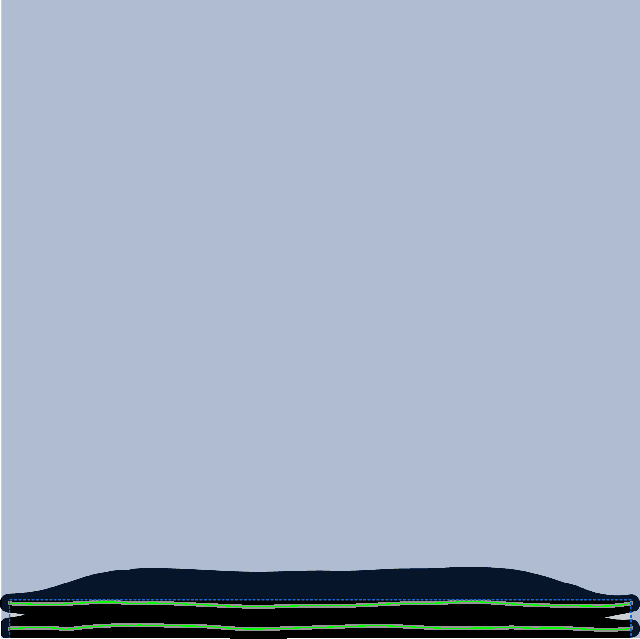
(Note: The image also shows the pattern paths generated by the Linear fill. We would see these paths highlighted in the interface if we converted the Linear fill to Handmade. But we don’t need to do this conversion just yet.)
Words become fire
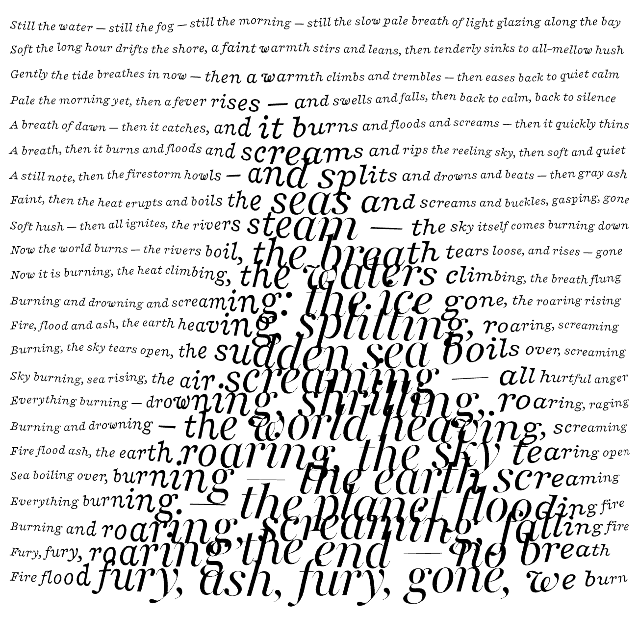
We add a Text fill. We hide the just-added Linear fill and specify it as the base layer for the Text fill. We pick the font Playfair Trumpet Italic. This defines the default instance value for all axes. Then we choose OpticalSize as the variable axis.
We add our text: pre-wrapped lines, each shorter than the previous one, and we choose the Line by Line repetition. Vexy Lines pours the poem into the silhouette: letters small and still at the top, swelling and breaking apart toward the roar at the base.
The brightness of the pixels chooses the instance along the variable axis — even if your stroke thickness is fixed (has no range).
Laying the embers
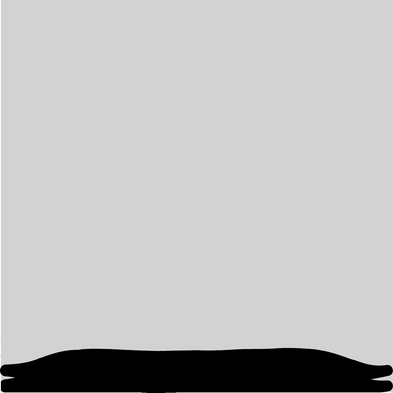
We create a new layer, and add a second Linear fill, which we hide. We draw a small rectangular mask at the foot of the flame. This builds the ground the flame stands on: a low bed of horizontal heat.
In this case, we’ve drawn the mask explicitly where we want the final line of text to be.
As an alternative, we could activate Mask Overlay in the top layer: the top layer’s transparent area automatically becomes opaque in the bottom layer, ensuring that the fills across two different layers don’t overlap.
The last line
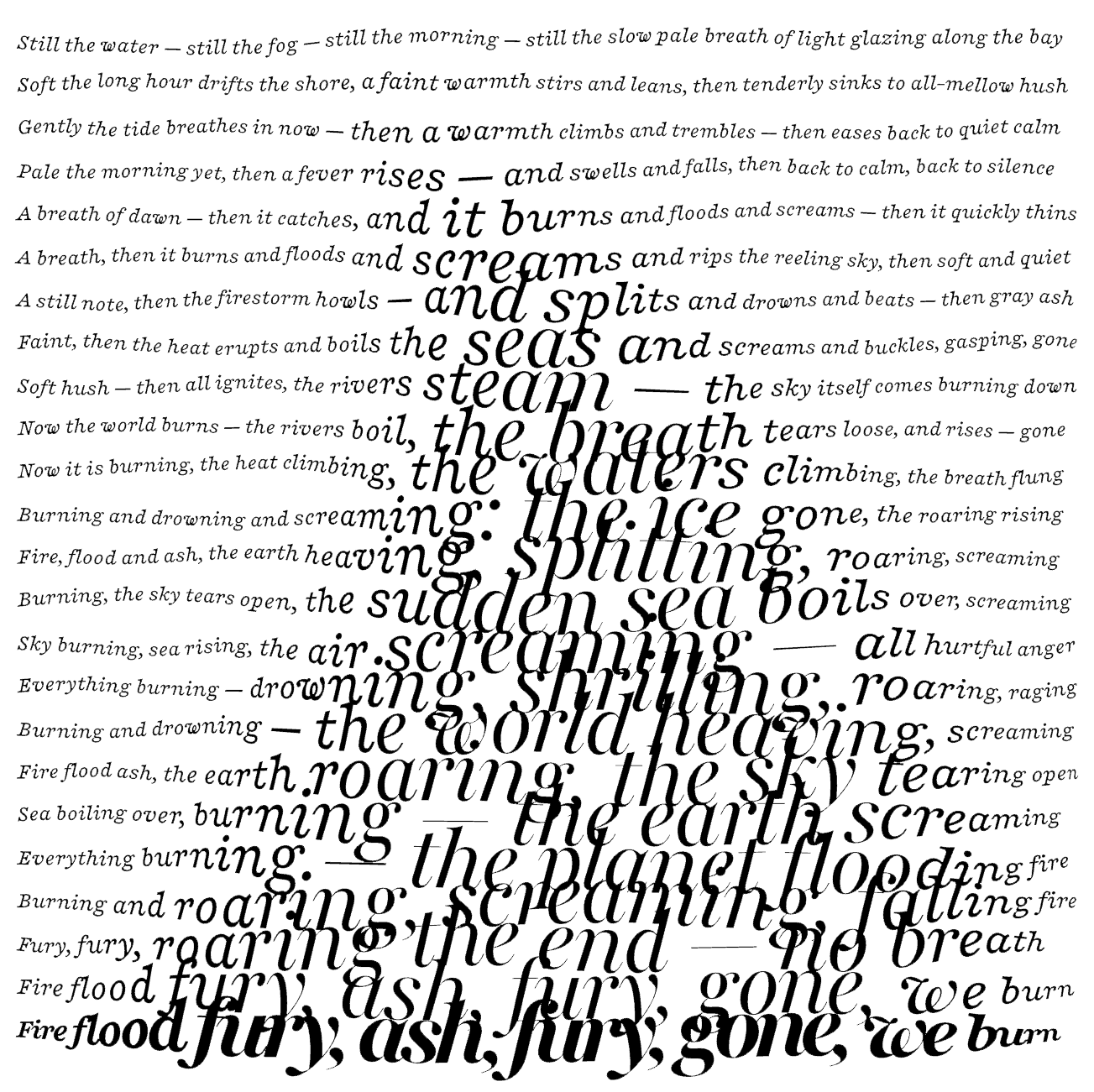
The final Text fill based on the hidden Linear fill drops the closing words into the embers: the poem’s final breath, settling as everything burns down.
For the final line of our poem text, we use the Playfair Trumpet ExtraBold Italic font instance, and we vary it the same way as in the top layer.
Always sharp, always fresh
All fills stay live and fully vector. Save the document as a .lines file. Then export it as SVG or PDF a vector document next the .lines file, and place the vector doc as a linked file or layer into your design app (Photoshop, Illustrator, InDesign, Affinity).
Tweak the artwork in Vexy Lines. Press Cmd+E or Ctrl+E — and the linked artwork refreshes in the design app. Your composition stays fresh and sharp.
Make your letters dance
Automate & animate: CLI, MCP, Python
With the Vexy Lines Run companion app, you can batch-process Vexy Lines docs, and you can create animations by applying Vexy Lines fills to all video frames.
The Vexy Lines CLI command-line app & the MCP server, and the Python libraries give you and your AI coding agent programmatic Vexy control.
Vexify your image.

Vexy Playlines: Web tool that turns your photo, drawing or AI image into vectors.
The Text fill is not available in Vexy Playlines.

Vexy Lines for Mac & Windows: Desktop app for pro engraving, hatching, halftones, auto-traces, masks, meshes.
Support for variable fonts and the Text fill is only available in Vexy Lines.

Vexy Linestra for Adobe Illustrator: plugin that turns any object or bitmap into vectors.
The Text fill is not available in Vexy Linestra.